This week I finished my website. In order to do this I had to make the movie poster, get the icons for each page and make some finishing touches to the site. I finished the poster on photoshop, using a still-shot from the movie and adding in the movie title and when the movie was going to be released which was boxing day, in cinemas. This took Tuesday and most of Wednesday's lesson. In the rest of Wednesday's lesson, I found some icons for each page. I found a house for the home page, a film reel for the trailer and a pen and paper for the story synopsis page. I couldn't find something I liked for the gallery or meet the characters pages so I made my own using photoshop. I put a picture of Dan and Lucy together into a photo frame for the gallery icon and then made an image where all of the characters were together for the meet the characters page. On Friday I made the finishing touches to my website. I activated each of the icons on each page as hyperlinks to their corresponding page. I then changed the colour of the background and changed the font and colour of it. I managed to finish in this lesson, so submitted my website to Mr Powell.
I got home today and looked at my website on my laptop, but found that the pictures didn't show up in the gallery. I hope this is because something is missing in my laptop because it isn't a mac or because I don't have the right software and that there isn't something wrong with my site. Anyway, I'm pretty sure that when both Mr Powell and I checked it that the pictures were actually in my gallery!
I'm pretty happy with my website and wish that we could really publish them to the internet!
Here is my poster for the movie. I hope you like it! :)
Over the course of this week I have continued working on my website. I have finished the gallery page and written the story synopsis. I have also made the meet the characters page by writing a description about each character - Dan, Lucy and Ben - and then by putting each of their photos next to their description.
On Wednesday this week I wrote the synopsis of the story for my movie. I also started my movie poster on Photoshop - and needed some refreshing of the memory there!!! I tried to start my trailer but couldn't get it to work on iMovie. I think it's because I tried to import a Quicktime movie into iMovie?. Anyway, I couldn't just add in the separate scenes again because I didn't have Lauren's part of the movie.
On Thursday and Friday, I worked on the trailer for my movie. Lauren was there so I got her scene and put it into iMovie along with my scenes. I then chose another song - Airplanes - for the trailer because it was nice and really gets the emotions going. I also didn't want to have the same song for my trailer and movie. I then thought of some phrases to put into the trailer that will make people more interested and want to see it and added them in. I also cut down the clips so that only the really good bits were in it and ended the trailer on the scene where Dan and Lucy break up. Here is my trailer. I hope you like it!!
Over this week I have been exploring iWeb and just getting used to the program. Mr Powell also showed us some more handy techniques to make things easier and make our website look better. I have also made a start on my website. I have looked around on other websites that have cool font and have a couple of options for the title of the movie. I have also cut a whole heap of pictures (around 25) from my movie so that I can have a gallery page on my website. I have also created the base for my website and have around 5 or 6 pages, so I'm going quite well. Today Mr Powell got us to set up Dropbox, so that we will not have to use our USBs anymore. I'm not quite sure about it but I'm sure that as soon as I start using it I'll get the hang of it.
Mr Powell told us that our website must have: -a front page -trailer -something about the characters -synopsis of the story -movie poster -be at least 5 pages
These are my thoughts about what I will put in my trailer: -show relationship start -show relationship 'blossom' -show break up and write 'will their relationship survive?' beforehand
Today Mr Powell went through iWeb and showed us some of the basics. I now know how to create a page, add photos and films and create hyperlinks.
This term we are creating a website for our movie. We spent the first couple of days browsing official movie website and finding out what they have in common.
What movie websites have in common:
Front page before enter site: -poster/picture -name of famous actors above title -title (in top left corner) -watch trailer -follow and share on twitter/facebook -release dates / something to click on to buy tickets -enter site
Next pages have: -short reviews quoted on front/home page -story synopsis (about the film) -cast information -filmakers information -downloads like wallpapers/screensavers -photos (gallery) -characters information -videos/clips
So Thursday's lesson was a little hectic to say the least. Unfortunately, Lauren didn't manage to complete the formal scene so we made do without it. I then had to export her other scene as a Quicktime file and add it in to iMovie. After doing this, I added in the music from Lauren's USB and then worked on the opening credits as well as fading out the final scene. I then got Mr Powell's help to fade out the music also. We finished right on the bell but had to stay in for a couple of minutes after to transfer it to Mr Powell's computer. If I had my time again I would definitely make sure that I started putting it all together at least the lesson before it was due! I just wish that I had had more time for editing such as scene transition and I guess it would have been nice to work on sounds relevant to the scenes rather than just having a song playing. If only I hadn't used so much time when the park scenes kept on freezing....... I am actually pretty happy with what I've done though. I think the story is pretty clear and that the animation is of good quality. I also think the audience can feel and sympathise for Dan. I will try to post our movie soon!
In Tuesday's lesson I finished the scene where Dan is writing the letter to Lucy and crying in his bedroom. I coloured in the walls and carpet, made Dan's hand and pen move to make it look like he is writing, made him cry and exported the scene as a Quicktime movie. I then stared the final scene where I put the lockers in the background and traced Dan and Lucy. I also put Lucy in front of her locker.
In Wednesday's lesson I continued working on the final scene. I made Lucy take the note out of her locker, showed the note and began to make Dan run into the frame and then the bell rang. I then worked on it again after school in the library and finished the scene by making Dan run in and making Dan and Lucy kiss. I also finished the first scene by making Dan look at Lucy with a huge smile and making Lucy glare back at him. I then exported the files and had a go at putting what I have of our movie into iMovie.
This week I started a new scene. This scene is one where Dan sits on his bed and writes a letter to Lucy whilst crying. I have imported and traced a bed and a bedside table and made Dan sit on the bed and hold a pen and some paper. All I have left to do is make Dan write and cry.
Ok, so this post is a little bit late. I did have it written down as a hard copy but just didn't get the chance to put it on my blog. These reflections are for Week 7.
Over the week I have worked on the scene where Dan and Lucy walk to the bench in front of the lake. Over the week I managed to finish the background and make Dan and Lucy walk. I wasn't too happy because we didn't get Friday's lesson because of the Gold Coast show, but this didn't matter too much because I hired a laptop over the weekend. And boy, was that a semi-successful disaster!
On Thursday night I managed to get Dan and Lucy to hold hands while they walked, which was a very fiddly task!
On Friday, I made Dan and Lucy walk to the actual bench in front of the lake (which meant creating another background) and make them sit on the bench and Lucy put her head on Dan's shoulder.
On Sunday I finished this scene. I made the sun set while Dan and Lucy were sitting on the bench, made Lucy walk off scene and Dan get punched out by Ben, the guy who likes Lucy and wants Dan out of the picture. Even though this doesn't sound like all that much for the six and a half hours I put in, it was because of the annoying computer and program! I would do a bit on the scene, then go to save it, only to have it say that it couldn't save because of some error when saving to my USB or becuse the disk space was full, even when I only had one other thing saved to the desktop which was the previous saved version of what I was working on. I ended up losing about 2 to 3 hours of work in total - after losing 30 - 45 minutes of work about three or four times! So annoying! In the end, I figured that if I opened the scene off my USB, worked on it for 30 minutes then saved it to the desktop, then transfered it back to my USB, moved the one on the desktop to the trash and then emptied the trash, and started the process over, it would work. Time consuming, I know, but much better than starting something over that you've already done!
Just when I finished the last little bit of the scene, I went to save it. It told me that there was an error when I tried to save it as an Animation-ish file to both my USB and the desktop. So I exported it as a Quicktime file. I then tried to save it again, but then Animation-ish just quit! So I didn't save the scene as an Animation-ish file but only as Quicktime, which I guess is ok because that's the one I'll need later. I just hope I don't have to make any changes to it *fingers crossed*. I then had a panic attack because when I played it on my own laptop it wouldn't play on Windows Media Player, but then I realised I could play it on Quicktime, and it worked! Yay!
Hoorah to the end of this scene - I am so happy!!!
This Tuesday I was at the math competition so I didn't get the chance to work on my animation.
On Wednesday, I imported the images of the background, preparing to trace them, only to realise that I didn't have to! I also realised that I didn't have to spend all of last week tracing them either, as I just needed to import them and then leave them as I wasn't planning on changing anything. So frustrating!!!! Anyway, so I spent the lesson exporting a couple of the scenes I had already done and finishing the scene where Dan and Lucy stand up from the bench. I then began to work on the scene where they start to walk away from the bench.
On Thursday, I continued to work on the scene where the two walk away from the bench and am nearly finished. I also exported a couple more scenes, so now all of the scenes that I have done so far I have as Quicktime files. I will put them on my blog soon, so keep an eye out for them!
I was going to borrow a laptop for the weekend, but because I wasn't there for Tuesday's lesson and Mr Powell wasn't there for Wednesday or Thursday's lesson, I wasn't able to get the form signed in time as I didn't have enough time to find anyone to do this. Now that I think about it, I probably just could have got Miss Bardsley to sign it. Oh well, I WILL make sure that I have a laptop for next weekend, which is a long weekend thanks to the Gold Coast Show, to work on my animation.
‘Factory’ by Miwa Matreyek seems to have been made using predominantly iStopMotion. In the first scene of this movie I see people wearing exactly the same uniforms and carrying a tool box. They are walking into what appears to be a huge factory and are checking their watches quite often. The camera moves above the factory to where I see lots of smoke coming from it and blimps with ships attached by rope underneath them. The scene changes to inside the factory where I see lots of machinery. There is a massive hand and part of an arm attached to a piece of machinery going through the motions of picking something up and putting it down in the top left corner. In the bottom right hand corner there is a woman surrounded by computers who is looking at things and typing. Some of the same men that I saw at the start are walking through the centre of the frame. The scene changes to another room where there is the same woman as in the previous scene typing in front of a whole bunch of ‘computers’. She is wearing the same uniform as everyone else and using two keyboards with one hand on each. A person in the background is wearing white and holding a clipboard. She walks in, looks at the woman, takes some notes and walks away. The scene changes to another room where there are two men in the same uniform as before. The man in the foreground is moving in a squat like action and holding a massive spanner which is moving a nut and making the machinery work. The other is behind him and is doing a similar thing but using a smaller spanner and only his arms. There are lots of other complex-looking machines surrounding them. The scene changes yet again to another room where there is another man in the uniform levering a spanner and making a machine move up and down which is making the huge blender mix something. There is more machinery in the background, although it is stationary.
The work all of the people are doing is very repetitive, boring and unchanging. I think that the mood of the work is grave. The music is very dark and foreboding, the video is in black and white, everything appears to be very structured in the factory and everyone is working. The workers are not smiling and do not appear to be having a good time at all.
I can tell that this movie has been edited because the smoke that is rising out of the factory at the beginning doesn’t quite line up with the chimneys and has edges that are too harsh around the blimps. Also there are things in this movie that couldn’t possibly have been filmed without editing, such as the mechanical hand and the size of some objects. Evidence of editing also included the brief pauses in music and sound effects as a change of scene occurred.
The scenes in this movie flow in a logical progression. Everything happens in the order that it would in real life and time. The movie contained a lot of attention to detail. Many layers have been used in order to get the effect of the movie and a lot of effort would have been put in to make them line up with such precision. Detailed pictures also made up the background.
The majority of the shapes in ‘Factory’ are geometric and the whole movie is in black and white. Most of the objects in this movie are in proportion. There are however, objects that are not, such as the massive hand, spanners and blender. I believe that the enormous tools the people use are so big to show how hard the job is and possibly even to draw attention to them or use them as a focal point. The quality of movement was quite good, only with the slight stilt of iStopMotion or a similar program.
The music was very low and deep and seemed grave, dark, mysterious, solemn, and indicated danger. There were also sounds of beeping electronics, sliding, humming, clunking and whirring machinery and engines, fog horns, hammering and movement. There was not, however, any dialogue. The music was of quite good quality and was quite clear, but the sounds were not of very good quality and sounded as though they were a bit muffled.
I believe that this work is about how we really are when it comes to the work force and the pollution we are causing. The smoke that comes out of the factory and fills the sky represents the huge amount of pollution that we are spilling into the environment. The blimp carrying the boat represents the fact that we are wasting water, as there will be no water left in the world so we will have to use the skies for things that were meant for the oceans. Even though the large mechanical hand is going through the motions of picking up something, it really isn’t and represents the fact that we are working for nothing. The whole factory seems very cluttered and full of ‘stuff’ and represents the way we live our lives, for we are always busy and don’t have time to organise things properly. The way that everyone works is very repetitive and boring and sends the message that we are working like machines. It also seems as though everyone is being overworked and as though there is nothing enjoyable about working, hence the dull colours, grave music and lack of life in the people.
My mum thinks that the work is about how people are living a robotic lifestyle. She thinks that it is showing that we are doing a lot of work and achieving nothing and that there is a lot of pollution on the earth. My dad thinks that the work is about how people don’t think anymore and just do what they have to, which is resulting in people becoming like machinery. Kate thinks the work is about global warming which is caused by modern day technologies.
I think that the intended audience is people that are in and entering the workforce. Although there is no clear outright purpose or meaning of this piece of work, I believe it was made so that this group of people can see what is really happening in the workplace and do something about it.
Matreyek has effectively used sound with animation images to create meaning in this piece of work. The music, sounds and images all tie in together to create a piece of work with a deep, hard to see meaning and a theme of there being too much emphasis on work and the fact that it is currently boring, repetitious and in a very solemn environment.
Well, I haven't really done much this week but trace what I have already done. I thought it wouldn't take that long, but it has actually taken like all of the lessons this week. I am very nearly finished the scene where they get up, so next week will be able to make them walk to the lake, which will just involve more tracing and making Dan and Lucy hold hands while they walk.
I finally exported one of the scenes of my animation. It is the first scene where Lucy drives into school and Dan walks in. I still have a little bit more to do, such as the evil glare Lucy gives Dan and then this whole first bit will be finished!
On Wednesday I opened the scene where Dan and Lucy are sitting on the bench and found that it went all funny in the middle. I discovered, eventually, that this was because I had copied one frame and pasted it many times, but had changed the arm position of Dan in just one of the frames, which made them all change also. I spent a lot of Wednesday's lesson trying to fix this and came up with a solution that actually worked a couple of minutes before the bell. It was to copy the frame into the background, trace it in the foreground and then delete it in the background, which was very time consuming but the only thing I could think of. Unfortunately, I was unable to finish this before the end of the lesson so spent a bit of Thursday's lesson working on it. I had finished fixing that glitch by halfway through Thursday's lesson so was able to start making Dan and Lucy stand and prepare to walk away. I decided that the best way to do this would be to just copy the first frames of the scene and reverse them. This worked well until I had to make the "camera zoom out" using key frames as I had to start a new scene because there were already key frames in the foreground and background of this one. This meant that I had to export the last nine or so frames and trace them in a new scene, which I started on Thursday, but haven't yet completed.
Today I worked on the scene where Dan and Lucy sit on the bench. I managed to make them hold hands and lower their heads. Even though this doesn't seem like much, it is actually very time consuming.
Over the weekend I borrowed a laptop from the library and spent a couple of hours working on my assignment. I made Dan and Lucy walk to the bench, sit down, talk and blink. I even managed to make it look like the camera zoomed in by using key frames.
Today two people that I don't know came into our class with Mr Powell. Mr Powell wanted to show them my animation, so I wasted a fair amount of my working time waiting for it to load and showing them. With about twenty minutes left, I learnt (thanks to Lauren) how to transfer a scene from one Animation-ish file to another. You go share, something like pictures in frames, and then save the pictures somewhere. You can them import the pictures to Animation-ish where you can then trace them. I had almost finished tracing Dan, Lucy and the background by the time the bell rang. I am also going to hire a laptop over the weekend so that I can work on it then.
Today, at long last, I FINALLY finished the scene where Dan and Lucy walk to the park bench. After many freezes two system restarts and deleting over half of my work (which was already saved in another scene) to make the program move a bit faster, I finally managed to use key frames to make Dan and Lucy move towards the bench. I also managed to transfer the bench from the foreground to the background (which was actually quite easy) so that the bench wouldn't move with Dan and Lucy when they walked. I am soooo happy that this scene is finished because now I can move onto a new one, that hopefully won't freeze *fingers crossed*! :D
Ok, so today we did our Rushes. I worked on the walking park scene in between other people's previews, and after many freezes, managed to get the background to move behind Dan and Lucy to give the illusion that they are walking. I had just finished this when Lauren and I went up to show the class our previews. I think that most people liked our animation, but it was hard to tell because most of their faces were expressionless. We did, however, get some feedback from Mr Powell, who said that he liked our animation and thought it was very good from a technical perspective. I don't think that we need to change anything really at the moment, but will have to get our butts into gear to be able to get this finished on time, especially considering we have to put sound in too!
Today's lesson just topped off Tuesday's! I again worked on the scene where Dan and Lucy walk through the park. Once again, the program just kept freezing! I finally got this part of the animation to where I wanted it and then about five or ten minutes before the end of the lesson, the program froze again and stayed that way until after the bell. So when I couldn't wait any longer, I just had to shut down the computer so I could safely remove my USB. I had been saving progressively to the desktop throughout the lesson, but couldn't copy this to my USB at the end because I couldn't access anything else but Animation-ish - which was frozen!!! This lesson was extremely frustrating and was practically a complete waste! :(
This was the worst lesson ever!!! (well, almost). I spent the whole lesson trying to make the background move so that it would look like Dan and Lucy were walking. I actually did achieve this but the background was moving too fast at first, and then it moved way too slow and then the program kept on freezing! So frustrating!!! I thought that this was because I kept on pasting over things, instead of deleting them first, so attempted to delete all of it and just paste in the final copy of the background, causing the program to freeze again. Eventually everything began working again and I manage to make Dan and Lucy walk through the park, although I still am not quite happy with the speed. I will also have to find a way to put the park bench in the background next lesson.
This lesson I began working on the background in the park scene. I found this quite easy, thanks to my storyboard, as I knew exactly what I wanted the background to look like. I managed to draw the footpath, and the trees and plants and even imported a picture of a bench and traced it. Unfortunately, I didn't have time to make Dan and Lucy sit on the bench, so will do this next lesson.
Mr Powell also talked to us about a preview sort of thing for our movies. I think that this is a really good idea because we will be able to get some constructive feedback from the rest of the class and then make changes to our animation accordingly. Although, I am a bit concerned because Lauren and I have been working on different scenes from all over the place in the story, so it might not quite make sense to the audience, meaning our feedback may not be all that constructive. Hopefully, we will be able to fill in some gaps in the storyline before the "preview".
Over the past two days I have worked on the scene where Dan and Lucy walk into the park. I have successfully got them both walking, which is actually a lot harder than it looks! I found it took a lot of time to put in the detail of the characters and morph their look with the traced shapes of the "walking man" off BlackBoard. This was also quite frustrating as it was very hard to get the lines all the same thickness. Next lesson I will work on the background and make Dan and Lucy sit down if I have time.
Ok, so I did a little bit more work on the assignment, but am a little frustrated with the first scene because it's not quite working at the moment, so I will work on something else before I come back to it. I am now working on the scene where Dan and Lucy walk through the park together then sit on a bench. I have successfully put their bodies on the frame of the traced walking man, which makes it look pretty good now, I think. I have also decided that I will not make them hold hands yet when they walk in together, but will make them hold hands when they get up from sitting on the bench and go for a walk in the park together. I'm pretty happy with what I have done so far, but just wish that I'd done a little bit more work over these holidays because I am worried that it won't be finished by the time its due.
It's the holidays, but I hired out a laptop and drawing tablet from the library so that I could work on my assignment over the holidays. So far I have manage to fix the part where Dan walks into the first scene, and just have to make him turn around to face Lucy. I have also traced the walking man frames into Animation-ish so just have to morph that body into the bodies of Dan and Lucy, and then make them hold hands.
On Thursday's lesson I finalised the scene where Lucy drives into school and started trying to make Dan walk into the scene also. This is actually really hard! I had to put Lucy and her car into the background and then draw the different frames of Dan walking in the foreground. Unlike my previous attempts where I traced the frames of the walking man off BlackBoard, I can't do this because I need to have Dan seen from the back, not the side. So far, I have managed to get his legs to move, but they go really fast, so it looks like he is running! I will have to work on that and his arms next lesson.
I actually finished the storyboard a week and a half ago, but I thought it was too messy so I did it again progressively, as Lauren and I could still work off the rough one. I finished the good copy of the storyboard a couple of days ago, but haven't had the chance to put it up until now.... so here it is!!!
In today's lesson, I managed to put Lucy in the car and make the wheels and her head move, which I think will look pretty good when the background is actually moving to give the illusion that the car is.
One thing that I discovered is that you can actually make the lines thinner than what they would be if you drew them using the smallest pen size. You can do this by drawing the line and then dragging in the corner to make it smaller, which also makes it thinner. I discovered this when I put Lucy in the car and then tried to draw her arm hanging out of it. The pen was on the smallest size, but the line that was going to be her arm was so much thicker than the rest of the lines outlining her. I figured that this was because I had drawn Lucy but then made her smaller.
All I have left to do next lesson is make the background move behind the car to give the illusion that she is driving.
In class today I started the first scene of our story where Lucy drives into school. I managed to draw the background, the car and trace Lucy. Next lesson, all I have to do is put Lucy in the car and make it drive along the road into school. Lauren kept researching how the different characters in our story might look.
We are making progress! Lauren was away last Friday, so I couldn't really do much without her considering we hadn't done a storyboard yet, but today we did over half of our storyboard which is on track to be finished by next lesson. Then all we have to do is know exactly what our characters are going to look like, finish the storyboard and begin!!! YAY!!! :)
p.s. I will put the storyboard up on my blog when we are finished...
At first I was going to work by myself using Animation-ish. My story was going to be about a family that goes on a car trip, but the story was not very interesting at all and would have put the audience to sleep. There were also too many characters to focus on.
I then decided that I was going to work with Lauren Pennisi. We decided on iStopMotion and were going to do a sort of 'Toy Story' toy war where someone walked out of the room and then the toys came to life and had a huge fight. This idea didn't work out because the story line wasn't very good.
We then came up with our current idea (that we are actually going to use) which is on the post below this one.
I will be working with Lauren Pennisi and we will be using Animation-ish.
Our story will be about a poor boy who meets a rich girl at school, who is forced to work on an assignment with him even though she doesn't want to. They spend time together, working on the assignment, grow closer together and fall in love. Another rich boy becomes jealous of the poor boy and bashes him, threatening to kill if he doesn't break up with the rich girl. The poor boy breaks up with her and they are both unhappy. They see each other at the formal and realise that they are meant to be together. The poor boy walks up to the door of her house and leaves a letter that she reads, then she meets up with him and they get back together.
This is my first attempt at using iStopMotion. My idea was to have things escaping from my pencil case. I am pretty happy with this attempt, although I just need to make sure that I keep my hands out of some of the frames. Here it is!!!
Tips: -break movie up into scenes - saving purposes so if it is lost will only lose small part gone not whole thing -quality not quantity!!! -don't just make a film with fun techniques - must have a storyline -could use lego/clay
Using iStopMotion: - save as iSight full on desktop (drag it from desktop to USB at end of lesson) -press space bar to capture an image -file, export, (as quicktime) to save to put on blog
Today we learnt how to add sound to our movie. This is the animation of my walking man with the sound of his footsteps. Some of the sounds aren't quite right on the footsteps yet, but anyway, here it is!!! :)
Tip: work in scenes on Animation-ish (scene 1, 2, 3, etc.) so that the key frames won't go all funny
To add a sound to your animation: - share the animation in Animation-ish as a Quicktime file in the movies file (so it can be easily accessed in Garage Band) - open Garage Band and open a new file in 'movie' format - drag your Animation-ish movie into the middle section at top - click once on the movie track to get a preview - chose a sound and drag it up onto the middle section at top - 'apple T' to trim a sound effect - align the sound effect with the movie to where you want it to play - to save as a Quicktime file, click share in menu bar at the top, 'export movie to disk' and then choose expert settings where you choose "Windows to Quicktime"
- the little slider at the bottom of the section under 'tracks' will show more frames in your movie so that it is easier to allign the sound effects
Today I exported the image of the frames of the walking man off blackboard onto animation-ish and traced them to create this version of my walking man. I put the man in the foreground, the ground line in the background, and used the key frames to move him across the screen. Here it is!!!!!
Here are just some little notes to myself that I can refer to if I forget how to do something.
To make animation in foreground move across screen using key frames - shift, click, copy, paste around 50 frames for approx. 5 seconds worth. -key frame 1st and last frame by clicking little box with plus sign. Can take away by clicking box with minus sign -click on transform (little truck) and when on first key frame drag it to where you want object to start, when on last key frame drag it to where you want it to finish. You can change size and shape of objects in key frames and the computer will move it and change size of object gradually over course of travel of object -can add another key frame at any point & drag it down so that the travel path can be curved or whatever (not just a straight line)
To import something:
- save image for background (e.g. off google), click import, open image
To zoom in on background:
- add key frames in first and last frames
- make first image small and enlarge last image to however large you want it to get
- when played seems as though it is zooming in on image
To colour in an image (a good idea if it is see-through or hard to see!):
- double click on colour palate to get a lot more variations/shades colours
- fill in all the gaps in outline of the shape so that the program will fill it for you
- click on bucket in 'tools' on the left
- choose the colour you want off the colour palate
- click on the area you want to fill in
Some tips:
- it is only possible to have one imported image in the foreground/background at once
-to "steal" someones image so you don't have to import it (so you can draw it yourself accurately):
- save image,
- import it
- go over it with pen (like tracing)
- delete imported image!
-idea - could zoom in and then start animation in foreground
Today in class we looked at some of the projects that people in year 9 submitted last year. There were some really good ones on i-stop motion and animation-ish. We then had a go at making a person walk on animation-ish using the tutorial off blackboard. I used a stick man, though as it was my first attempt.
Today in our first lesson for the term we had a play with Animation-ish. We had to make a ball bounce, by going off the tutorial from blackboard. I really liked this activity and found it was lots of fun. Here is my bouncing ball animation...
I think the whole process went pretty well for me. I used my time pretty well, as I came to lessons on time and went pretty much straight to work once I was in class. In class I didn’t really talk much or stuff around with things that I didn’t need to, so I was fairly productive with the time I had and used.
I managed my blog alright. At the start of the project I kept it up to date really well, but near the end all I wanted to do was keep working on my avatars on Photoshop, instead of blogging. This meant that I also did not do much blogging for homework as I worked on my avatar at home on my trial version of Photoshop that I downloaded. I kept telling myself that I still had ages until my assignment was due and that I had already done most of it, which was clearly not the case as I still had to do my personality profile, reflection and evaluation. I was however, quite good at keeping my drafts and posting them.
I think I had a good saving method. I saved each draft for each image as a JPEG under the name of ‘draft 1’, ‘draft 2’, etc. I also saved a copy of my Photoshop file for each image to my USB and created a backup copy of this at least once a week.
I am quite pleased with my final result. This is because I think that my avatar’s look pretty similar, which is good because they are the same person. Also, the colour scheme is quite good, and the picture looks sort of normal and like it could be real – not like some cartoon image. Furthermore, I think that the backgrounds go well with the expression on my avatar’s face and that the images relate to the personality profile that I created. The only thing is that the eyebrows are a little bit dodgy and needed a bit more time put into them, but this can only really be seen when looked at up close.
If I had my time over, I would make sure that the strap from my top does not show. I would make the hair or something cover it. I would probably use two different people to start with instead of the same person. This is because the changes you make don’t have to be exactly the same, for example, the hair style, skin and eye colour, etc. I would also save separate Photoshop files for each draft, like I did for the JPEG images, and would ensure that I backup my USB after every lesson. This is because sometimes I would have two or three lesson’s work on just my USB - and I got a lot of work done in two or three lessons – so if I had lost my USB or if it had broken, I would have had no backups and would have been ‘stuffed’. If I had my time over again, I would use a slightly smaller image to start with (one around 6 – 8 megapixels instead of 12) as they will save a lot quicker than the 12 megapixel images in Photoshop, giving me more time to work on my avatar and blog. I also would work on my blog more and not give in to the temptation of working on my avatar instead. I also would not leave my personality profile, reflection and evaluation until the day before the assignment is due!
There were a lot of things that worked for me and went really well in this project. These included layers and masking, as they were super easy to use and were very effective. Also, the process of changing colours worked really well for me. Even though most things worked really well for me, there were a few things that gave me some trouble. For example I found it very hard to find a suitable background and hair piece that had a high enough resolution to not pixelate when placed on the image of my avatar. This meant that I had a very narrow range of images to choose from for my backgrounds.
I changed a few things along the way, but not too many. First of all, I changed the lip colour. It was originally going to be a colour similar to that of the skin, but I wanted a colour that had a higher contrast, so I went for a colour that was more bluey. I also did not end up adding in scars, or changing the ears and eyebrows. This is because they did not quite look right on the whole image and made the image look way too busy. I decided that the image looked a great deal better without these changes and that they did not match my avatar’s personality profile.
I learnt many things by doing this project. I learnt how to use layers, mask, desaturate, apple U, the opacity slider, free transform, and the marquee selection tool. I used each of these by doing the following. For the colour change in each feature or the addition of the hair and background I made a new layer and labelled it appropriately. I sometimes duplicated this layer. In the case of the hair and background, I pulled the opacity slider down so it was fairly see through and used ‘apple T’ or free transform to get them the right size on my avatar. For most of the layers, I then applied a mask and rubbed out all but what I wanted with the opacity slider down. I then used desaturate, and ‘apple U’ to change the colour of whatever I was changing to one that I liked. To change the colour of the eyes, I used the elliptical marquee selection tool, used desaturate and ‘apple U’ again and then rubbed out the middle of the eye – where the pupil is – and softened the edges using a mask.
I really like using Photoshop and learning about all the cool things you can do with the program while doing this project. I also liked and really enjoyed creating my avatar on Photoshop.
I dislike using and keeping the blogs, but realise it is a necessary part of the process. I dislike them because I find that the work we do on them is kind of boring, and that all I really wanted to do was the practical stuff on Photoshop, not the theory. I was frustrated by the speed of which my Photoshop images opened and saved on Photoshop, as it was really, really slow. I think this was because my original image was so big as I took it on a 12 megapixel camera.
My preferred learning style is to do a little bit of group discussion to get some ideas, and then work independently for most of the lesson. I prefer to have group demonstrations on the smart board and to take notes from these by myself. I also like a combination of visual and aural teaching, as I learn best this way. I like to take a few notes while we work on projects and to learn as I go on a basis of trial and error, as this helps me remember things better. I also like learning by doing lots of practice.
In this project, I took a few notes and brainstormed a bit at the start and then leapt straight into the creating part of the assignment, experimenting a bit with everything. I listened to the group demonstrations and applied what I had learnt from these to what I was creating, sometimes taking notes in the process. If I then did not know something, I would try to figure it out by myself, but would then ask for help if this did not work.
These are copies of the final avatar images that I submitted. The changes I made to both of my images are exactly the same, with the exception of the background and eye colour - which was made darker for the sad expression because the colour of my avatar's eyes go darker when she is sad. I chose to have light purple coloured skin and hair because my avatar lives in a hot climate, so these features need to be light coloured to reflect some of the heat so she does not get too hot. The colour is also a purple because the forest in which she lives in is purple, so she is able to camouflage and hide in it. She has lips that are a bluish-purple colour because this is the colour of the berries she eats. The berries have stained her lips because she eats this type of fruit the most and has eaten them ever since she was a young child. My avatar's eyes are a yellowish-green, similar to the colour of a cats'. This is because she is mainly active at night, so therefore has very good night vision. My avatar has scaly skin, similar to that of a reptile's. She has this because she needs it to grip the floor in the forest, retain moisture as the climate she lives in is quite dry, and absorb the heat needed for night-time activity as she is cold-blooded. Also, the scaly skin is quite tough and strong so that it won't tear when she is running through the forest. Her long strong hair also helps protect her from the forest when she is running through it. I chose to have two different backgrounds - one for each expression. I chose to have a burning forest in the background of the image with my avatar being surprised. This is because she loves her home, the forest and is shocked to see it being burnt down. I chose to have a destroyed forest in the background of the image with my avatar being sad because when her forest is harmed or destroyed, she becomes very sad and upset because she loves it so much.
My avatar is quite calm and easy going. She is generally happy, and always takes care of other species in her race, rarely fighting with them. My avatar and her race are quite primitive and love their home, which is a forest that is a purple colour with thick undergrowth and a slippery floor. She becomes very surprised and upset when her forest is being harmed or destroyed. My avatar is mainly active at night, and therefore has excellent night vision. She eats only fruits, from which she obtains all of her nutrients, although she mainly eats berries that are a bluish-purple colour. My avatar loves playing games that require running through the forest and climbing the growth. She lives in a very hot climate and has light coloured skin and hair that reflects some of the heat. My avatar and her race are cold blooded, so rely on heat from their sun to survive.
I was reading through the task sheet for this assignment and realised that it said to put on the original photos that we used to create our avatar - so here they are! The top one is the photo I used for the surprised image of my avatar and the bottom one is the photo I used for the sad image of my avatar.
I thought that I had finished the image of my surprised avatar, but after finishing my sad avatar I realised that I had to put a background (other than my room!) in that would relate to the expression on my avatar's face. I chose to do a burning forest because this is something that would shock my avatar. I used the same techniques to put this background in that I did to put the background in my sad avatar's image. I really like this background because it creates a nice colour contrast between my avatar and the forest.
This is the final copy of my avatar. I added in a background by putting the picture of the background on a new layer. I then duplicated the layer and added a mask so that I could change the main colour of the vegetation in the background to purple, which I did by using desaturate and apple u. I chose to use a trampled/wrecked forest because this is one of the things that makes my avatar really sad and upset.
This is the second draft of my sad avatar. All I have left to do now is add in the background, which I am still unsure about what to use for it. I really like the colour scheme I have chosen and like the eye colour especially. The eyes on this sad avatar are darker in colour than the eyes on my surprised avatar, this was not done purposely but works well because your eye colour sometimes changes a little with different emotions. I used the same techniques again for this avatar as I did for my surprised avatar.
I used the same techniques that I used to create my surprised avatar to create this first draft of my sad avatar. This is only the first draft, so I still need to add a lot to it. I need to change the colour of the eyes, the colour of my skin and lips and add a background. So far, I think my avatar looks quite good, and similar to my other avatar, which is good because I am using the same character for my avatar. I think I just need to tidy up the edges of the outline of the whole avatar before I add the other elements, especially the background.
This is my second and probably final draft of my avatar with the surprised expression. I really love the colour of the eyes. They stand out a lot and really add to the surprised look of my avatars face. I changed the colour of them by using the elliptical marquee tool and then desaturate and apple u. I also like the snake skin overlay, which was done by using layers, masks and a soft light overlay. I changed the colour of the lips and tongue also by using a mask, desaturate and apple u.
I had a play around with changing the size of different features and distorting them using the liquify tool, but found that the changes I made just didn't look right, and that the image looked so much better the way it is now.
Above is the work in progress of my avatar with the 'surprised' expression. To get this far I have put someone else's hair on my head using layers and masks. I also used these techniques along with desaturate, and apple u to change the colour of my avatar's skin, hair and eyebrows.
I quite like the way this image looks. I really like the colour of the hair and skin and the way the hair sits on my avatar's head. I will continue to add to this image to make an even better avatar.
I have been trying to find suitable hair for my avatar. I really like the one above and think I will use this on my avatar. I think this hair style will look good because it is long and straight and being blonde, it will be easy to change colour.
I am thinking of using elf-like ears like the ones above. I quite like the point in the ears, but I would like to make them a bit bigger and wider. I am also thinking of using scars like the ones above. I will not just copy and paste these onto my avatar, instead I will create them myself, as the site from where I got the picture from is actually a Photoshop tutorial site which tells you how to create them. I hope to give this a go in an upcoming lesson.
Today i learnt how to use a few more tools in PhotoShop. I learnt how to use the liquify tool and the inverse tool. To use the inverse tool you must click select, inverse and then press delete. This is really handy because it deletes everything but what you selected. To use the liquify tool, you must click filter then liquify. This tool is really good because you can easily transform things.
I have decided to make my avatar race of people quite primitive. I am currently thinking of having eyes similar to the cat's above but make them bigger than normal, and having large ears. I am also thinking of using snake skin, quite light coloured skin and big, thick, bushy eyebrows like the ones on the picture above as well as putting scars on its face and making the colour of the skin go darker when my avatar is angry.
Today I did another practice using the random woman and some of my ideas. I used zebra skin today. I much prefer the snake skin to the zebra because it looks a lot more natural, so I will use snake skin for my actual avatar. I also prefer the purple skin to the green, because even though they both look good, green is stereotyped with aliens and is too cliche. Next lesson I will try some other effects on my avatar, hopefully cloning will be one of them.
In today's lesson I had another think about the design of my avatar. I also had a go at using some of the ideas I have come up with on a random woman off the internet.
As you can see in the picture below, I put the snake skin over the skin of the woman and changed the colour to green. I then changed the colour of her lips and mouth to blue. I quite like the effect of the snake skin and think that I will use this for my assignment, although I might give the zebra skin a try too, as well as some other skin colours. I have also found a willing candidate to be my avatar. She is Shauna O'halloran-Anderson, and I will take some photos of her soon and post them on my blog.
So today we had a think about what we were going to do to create our avatar for our assignment.
So far, I'm not quite sure who I'm going to use as my avatar. I'm thinking about just taking a picture of one of my friends. I'm also thinking about putting zebra or snake skin over their face and skin. I might make them have blue skin, but then that would be too similar to the avatars in the movie 'AVATAR', so I might just make them have light purple skin. I'm also considering putting a scar on my avatar's cheek. The two emotions that I'm going to depict my avatar in are probably going to be happiness and anger or frustration. The animal skin that I am thinking about putting over my avatar looks like this:
source: http://matt-sky.blogspot.com/2008_05_01_archive.html The image above is of an angry or frustrated child. The eyes are slightly narrowed and the brow is furrowed. The lips are parted and the teeth are clenched as though trying to keep the angry or frustrated emotions inside. The nose and most of the face is scrunched.
source: http://www.ehow.com/how_4919262_coworkers-angry.html The above image is of an angry or frustrated man. His eyes are quite tight and squinted and his brows are furrowed. Once again, his mouth is parted and his teeth are clenched, as though he is trying to keep his emotions inside due to the fact that he does not want to make a fool of himself, or he may not be able to express his emotions at that point or place in time. His hair is quite scruffy and messy and his hands are clenched in tight fists.
The above image is of a frustrated or angry girl. Her eyes are wide in anger and her brows are very arched. Her nose is screwed up and her mouth is open very wide with her teeth showing. Also, the veins in her neck are bulging. This image gives the appearance of the girl yelling at someone or something.
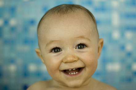
The above image is of a happy, carefree baby. It's eyes are wide and the eyebrows raised. It's mouth is stretched into a wide smile, with a few teeth showing. The image suggests that the baby is very happy and that there is probably someone or something around that is making it laugh or be so happy and smiley.
The above image is of a very happy, laughing toddler. The toddler's eyes are almost shut from the force of laughing and the mouth is open very wide, in a big grin. The image suggest what is very similar to the one above.
The above image is of a happy, smiling woman. Her eyes are very slightly closed and her brows slightly higher than usual. Her mouth is stretched very wide into a smile with her teeth showing, which suggests that someone or something has made her very happy or is going well in her life.
For the first three lessons of Creative Media this term, we morphed together an emu and a frog. By doing the same thing for three lessons, we were able to learn and remember the skills required to do so and were able to become quite good at doing it.
By doing this activity we learnt how to: -import images -rotate an image -use an overlay (new layer) -use opacity -use apple T (free transform) -use masks -use colorize and desaturation
These are the two images that I started with:
This is my final product:
I morphed the emu and the frog images together by doing the following: -First I opened the emu and the frog images in Photoshop -I then clicked image, image rotation, flip canvas horizontal (to flip the image) -I selected the emu head and dragged it onto the frog image -I changed the opacity of the emu's head to about 50% and then used 'apple T' to make the size of the emu's head the same as the frog's and line up the eyes of both the frog and emu -I then renamed the layer of the emu's head 'head' and duplicated the layer. I labelled the second layer of the emu's head 'beak' -I added a mask to the head layer and rubbed out everything but the hair on the emu's head. I also rubbed out the emu's eyes because they are the 'windows to the soul' -I clicked on the layer thumbnail (not the layer mask thumbnail) and went to image, adjustments, desaturate (this made the image of the emu's head turn to black and white) -I then pressed 'apple U' and ticked the box that said 'colorize' and adjusted the Hue, Saturation and Lightness until I had matched the colour of the head with others on the frog's body -I put the opacity back to 100% -I repeated the steps from adding the mask to the beak layer, this time rubbing out everything but the beak
Morphing together the emu and the frog was a lot of fun, and in the future I will morph other things together, and even create an avatar, so keep checking for updates! :)


